Designing a Lunchbox
The Challenge
In my Design Foundations course, I was given the challenge to design lunch packaging.
Scenario:
You are working for a major Seattle catering company who is launching a new line of affordable sandwich lunches for corporate picnics. The packaging must be protective, transportable, and it has to display a sandwich, cut veggies, and dip.
Deliverables
Physical, high-fidelity prototype
Context
Class project
Collaborators
Individual project
Time Frame
3 weeks
Working Under Constraints

User Research & Documentation
What is successful about the lunchbox packaging that people already use?
Are there parts of the design that are frustrating or need improvement?
What order do people eat each component of their lunch in?
Do people tend to repack their leftovers when they're done eating or throw the packaging away?
What size packaging is ideal for transportation?
Rapid Ideation
Generating ideas...
The next step was to quickly come up with as many ideas as possible. I tried to keep in mind the results of my research: people like to use the packaging as a plate and the packaging needs to be compact and easy to transport. Here's just a handful of my ideas:
click on a sketch to bring it to the front
 |  |
|---|---|
 |  |
 |  |
I decided to create low-fidelity prototypes of the following 3 ideas.
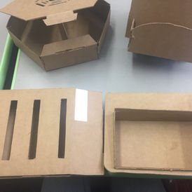
I ended up having to alter each design slightly in order to meet the requirement that the customer had to be able to inspect the lunch contents without opening the packaging.

_edited.jpg)

Prototyping & Testing
I struggled with balancing two requirements: protecting the food and allowing the user to inspect the contents of the packaging.

Some feedback I received from my peers was:
Due to the corners of the hexagonal packaging, it may be difficult to get the sandwich, dip, and veggies to be pack compactly.
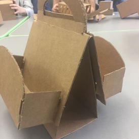
The design of the packaging with the handle would not protect the food adequately.
The rectangular lunch packaging was very practical, but the slits were are not very visually pleasing.
Iteration
I narrowed my focus to improving the first design with the handle because I felt the shape afforded carrying very well. Further, my classmate and I found it to be the most visually appealing design.
However, I needed to make some major changes.
I felt that I'd strayed from one of my main insights from user research, which is that people like to use the packaging as a plate, eating off of it. This would not be possible with the current prototype. Additionally, the food would not be well protected and multiple lunch boxes could not be stacked.
.jpg)

One of my classmates suggested that I invert the design - with the pocket-like containers on the inside of the lunch box. If designed correctly, two lunchboxes could be stacked by flipping them to face one another and rotating one upside down.

The Final Product

What I've Learned
This was the first time I've used contextual inquiry as a research method. I found this method to be very suitable for the project since observing individuals eating and using lunch packaging is very accessible on a college campus. I learned that it is incredibly valuable to get get feedback on your designs from individuals who are not invested in the project, whether that is the end-user or a peer.
Finally, learned how to balance many competing design constraints, which was definitely the most difficult part of this project.


